 an scan extract of my final design, the yellow having a glossy outcome.

25.5.11
23.5.11

18.5.11
ink screening


this was an attempt to do the mix of ink and bleach but through the screen printing. the bleach itself would be too fluid as i found out the hard way. the bottom print is a section of the attempted bleach print with another print over it (bleach ink and medium). however the medium worked against the bleach to create the sepia effect as shown on the 3rd one down.
fabric-ation


for the fabrics, the outcomes came out pretty well. the thread in the material in the beige felt makes the designs have more texture. its a good texture if any of my intended materials dont work.
17.5.11
printing experimenting


these were the attempts of printing on various materials to see which would work best for my final piece. the metal sheet worked nicely as did the poly-propane, which i will use for my final saw design. the wood gives a nice grainy texture which is what i'm trying to achieve. i'll be trying on fabric and latex tomorrow.
16.5.11
linodentity


experimenting with various printing techniques. i really like gritty worn down effect making it noticeable it being a lino print.
15.5.11


13.5.11
edinburgh festival poster


the front and back of the flyer was briefed by the comedians on the front for the edinburgh two hander show.
sense of identy invert


with these alterations, the designs have a slight vintage look to them. the thin lines don't show through properly however, like the air lines in the smelt design. slightly sepia. if i could i would like to have an emboss design and shiny lighter areas on top of a matt dark background.
sense of identity


these are my final designs which i will take on to screen print in a variety of colours. i will also have them printed on a large scale to have a mix of media. i will invert my designs to see what difference it makes
11.5.11
watercolour type
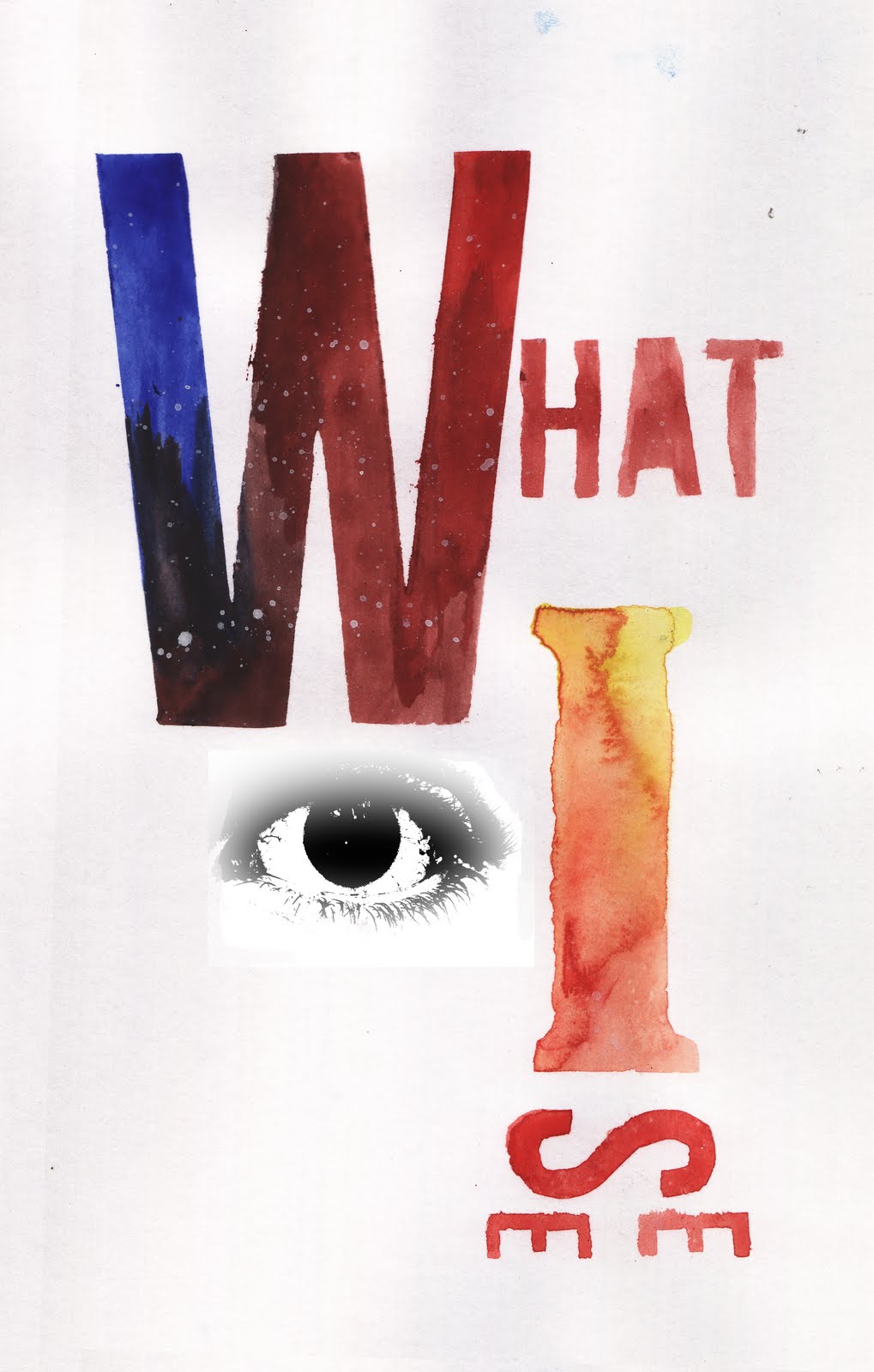 this is designed which i did in response to looking at alan kitching's work. related to my theme
10.5.11
fmp starting points


 for my identity themed graphic design based fmp i wanted to look at way to have some form of public interaction with the design. the plastic coating on both the images are both the same therefore if i have both images next to each other you could flip the plastic from one design to another. making the audience make their decision on what they believe relates to them.
5.5.11
stephen willats
 this was an initial response to the MAO poster design for stephen willats exhibiton. the lines made me think of outline of a city and the other side looks like another of the city.
Subscribe to:
Posts (Atom)